Rebranding
In 2020, I transitioned to work in graphic design and one of my very first projects was spearheading a full company rebrand. This was a dream project and I had so much fun identifying and building the company’s new visual identity.
The first step was to grab a pen and get down as many ideas as possible.
It was also important to consider the previous logo.

I decided to keep the turquoise color from the previous logo and suggested bringing in a green color as a nod to the rainforest.
After reviewing my sketches with our team, we identified some of the best ideas for further refinement (below).
I created graphics that were both a nod to the rainforest (trees, leaves, buds) and also represented ideas of innovation (light bulb moment, and bright ideas!).
In the end, we were advised to simplify the design to better align with other departments. We did manage to create our own uniqueness through color selection and subtle font differences.
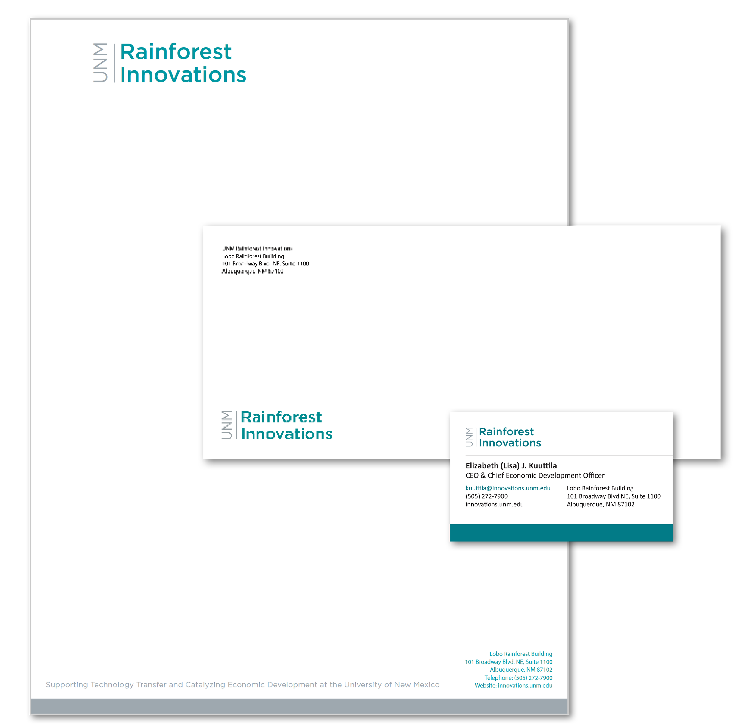
And the following was created:
Take a look at some of my logo projects here: